There is no clear-cut line of demarcation between a diagram and a graph yet -
- A graph needs a graph paper but a diagram can be drawn on a plain paper. In the technical way we can say that a graph is a mathematical relation between two variables. This however is not the case of a diagram.
- As diagrams are attractive to look at, they are used for publicity and propaganda. Graphs on the other hand are more useful to statisticians and research workers for the purpose of further analysis.
-
For representing frequency distribution, diagrams are rarely used when compared with graphs. For example, for the time series graphs are more appropriate than diagrams.
Types of Statistical Graphs
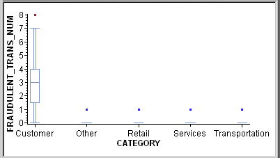
Box Plots
A box plot displays summary statistics for the distribution of values for a variable. The outer bounds of the box represent the first and third quartiles. The line inside the box represents the median. The markers outside the box, referred to as outliers, represent data points that are outside of the 25th and 75th percentiles.
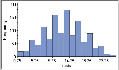
Histograms
A histogram is a bar chart that displays the observed frequencies of data that have been binned (divided into contiguous, equally spaced intervals). The heights of the bars indicate the relative frequency of observations in each bin. Histograms can also show binned response data if you choose a response variable other than Frequency.

0 comments:
Post a Comment